Predictive Edge Series
Predictive Edge 03: Support and Resistance
Draw fewer levels. Make each one count. Most retail charts have too many lines and not enough clarity about which ones actually matter.
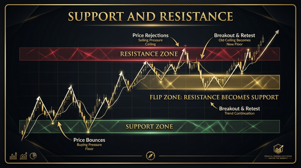
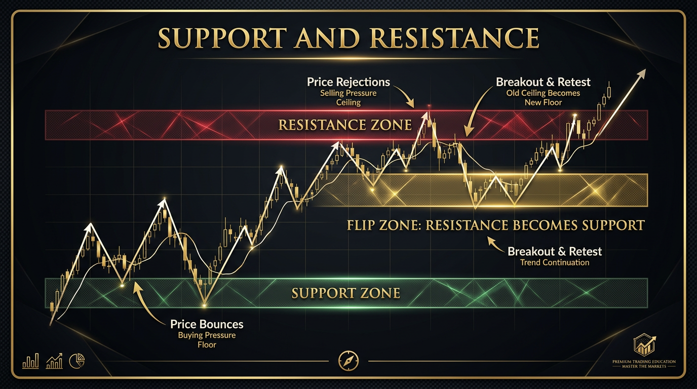
Zones, Not Lines
Support and resistance are not precise lines. They are zones. The distinction matters practically because price does not reverse at the exact tick of a prior high or low with consistent precision. It reverses within a range around those levels. If you draw a line and require price to touch it exactly to trigger your trade, you will miss valid setups where price reached the zone but not the precise historical print. If you trade every touch of the zone regardless of bar quality, you will take setups that had no genuine structural case.
The zone approach is more accurate to what is happening in the market. At a major structural level, large participants begin positioning in advance of the precise level. Orders accumulate in the area. The actual turning point may be a few ticks above or below the most obvious line. Drawing a zone with a defined width rather than a single line forces you to think about the range within which the structural case is active, and to assess price behaviour within that range rather than waiting for a single trigger point.
How wide the zone should be depends on the timeframe and instrument. On a daily chart of an equity index, a zone of ten to twenty points around a major prior high is reasonable. On a one-minute chart of a currency pair, the zone is tighter. The guiding principle is: the zone should encompass the natural variability of how price has interacted with this level in the past, not so wide that it loses meaning, not so narrow that it eliminates valid approaches.
How to Identify Real S/R from Noise
Most traders draw too many levels. The result is a chart covered in horizontal lines where price is always near something. When everything is a level, nothing is. The ability to distinguish genuine structural levels from noise is one of the highest-value skills in reading a chart, and it is built on a simple criterion: the number of independent reactions at that price.
A genuine structural level has been tested and produced a reaction on multiple separate occasions. The more touches with independent reactions, the stronger the level. A price area that price has approached three times and reversed from three times is a proven zone. Buyers or sellers, or both in different contexts, have made decisions at that price. The market has a memory there. A price area that price touched once and reversed from is potentially interesting but is not yet confirmed as a genuine structural level. It is a hypothesis, not a fact.
The other filter for genuine levels is recency. A level from three years ago is less relevant than one from three months ago, unless the older level also aligns with more recent price behaviour. Markets evolve. The participants making decisions today may not be anchoring to the same levels as participants three years ago. Recent levels, particularly those that have held or been broken within the current market regime, carry more weight.
Horizontal vs Dynamic Levels
Horizontal levels are fixed price zones where historical reactions have occurred: prior highs, prior lows, range boundaries, pre-session levels, and round numbers. They are static. The zone is at the same price regardless of when price approaches it.
Dynamic levels move with time. Moving averages are the most common example. A 200-day moving average is a different price today than it was last month. It represents a consensus view of value that shifts as new price data is added. Trend lines are another form of dynamic level, representing the slope of an established trend rather than a fixed historical price.
The relative importance of each type depends on context. In ranging markets, horizontal levels are dominant because the boundaries of the range are static. In trending markets, dynamic levels often carry more weight because the trend itself is defining the levels where reactions are most likely. The highest-probability setups are often where a horizontal historical level and a dynamic level converge at the same area simultaneously. Both types of participant, those anchoring to historical price and those anchoring to trend consensus, are making decisions at the same location.
Flipping: When Support Becomes Resistance
One of the most reliable and underappreciated dynamics in market structure is the flip: when a level that previously acted as support breaks and then acts as resistance on the return visit, or vice versa. The logic is grounded in what happens to the participants who were positioned at that level when it broke.
Consider a support level that has held three times. There is a significant accumulation of long positions from traders who bought at or near that level, expecting it to hold again. When the level breaks and price falls through, those long positions are now at a loss. Many of those traders are still holding, hoping for a recovery. When price returns to the broken level, the first instinct of participants trapped in losing longs is to exit at breakeven. That selling pressure at the prior support is the mechanism that turns it into resistance. The level flips because the positioning dynamic has inverted.
This makes prior support that has broken one of the highest-probability resistance zones available. You do not need to guess whether it will hold. You can reason from the likely positioning of participants who were caught by the breakdown. The same logic applies in reverse for resistance that breaks becoming support on the return.
Why Most Traders Draw Too Many Levels
The human pattern-recognition system is designed to find structure. Put a price chart in front of any trader and they will find levels. The problem is that not every bounce or pause in price represents a genuine structural level. Some of them are temporary imbalances, low-volume sessions, or coincidental stops at round numbers that do not reflect genuine institutional decision-making.
The practical solution is to limit yourself to a maximum number of active levels per chart. On a daily chart, three to five genuinely significant levels. On an hourly chart, three to four for the session. If you find yourself drawing more than that, the additional levels are almost certainly noise rather than signal. The exercise of choosing which five levels matter forces the discipline of ranking levels by genuine quality rather than including everything that could theoretically be relevant.
| Method | What It Identifies | Reliability | Best For |
|---|---|---|---|
| Prior swing highs/lows (3+ touches) | Proven structural zone | High | All timeframes, all instruments |
| Broken S/R (flip zones) | High-probability reversal area on return | High | Trading retests of breakout levels |
| Round numbers / psychological levels | Institutional order clustering | Medium-High | Confirming nearby structural levels |
| Moving average (200-day, 50-day) | Dynamic consensus value | Medium | Trending instruments, confluence with horizontal levels |
| Single-touch historical high/low | Untested hypothesis only | Low | Watch only until second reaction confirms |
| Arbitrary horizontal lines | Nothing useful | No edge | Remove from chart entirely |
Action Items
- Take your current chart and delete every level that has fewer than two independent reactions. If a level has only been tested once, it is a hypothesis. Mark it differently or remove it until it earns the second touch.
- For each remaining level, convert the line to a zone. Draw a band instead of a single line. The width of the band should reflect the natural variability of how price has approached that level historically.
- Identify the two or three most recent broken support levels now acting as resistance, and the most recent broken resistance levels now acting as support. Mark these as flip zones. Watch how price behaves when it returns to them.
- Limit yourself to a maximum of five levels per chart session. If you draw more than five, rank them by number of prior reactions and remove the lowest-ranked ones. Practice the discipline of fewer, higher-quality levels.
- Check every level you draw against recency. If the level is more than six months old and has not been tested since, assess whether it is still relevant to the current market regime before including it in your active levels.
Continue Learning
- Predictive Edge 01: Confluence
- Predictive Edge 02: Price Action
- Predictive Edge 04: Trend Analysis
- Predictive Edge 05: Momentum
- Predictive Edge 06: Multi-Timeframe Analysis